ブランドシンボル
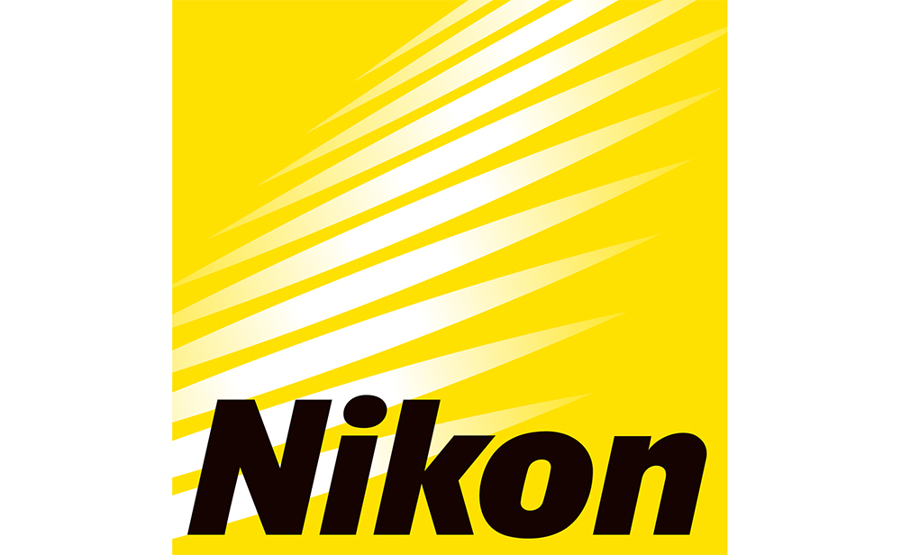
ニコンは時代のニーズに対応したニコンブランドの構築を目指し、2003 年に現在のブランドシンボルを制定しました。未知の可能性を「連続した光」によって表現したグラフィックエレメント、そしてイエローは「広がり」「情熱」、ブラックは「信頼性」「高品質」をそれぞれ表しています。ブランドシンボルをグループ各社の企業ロゴマークや商品パッケージ、ならびに広告・ホームページなどコミュニケーションツールに使用することで、広くニコンブランドに対する理解の促進を図っていきます。
ブランドシンボルの変遷
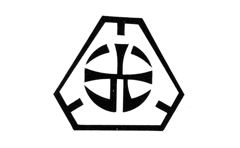
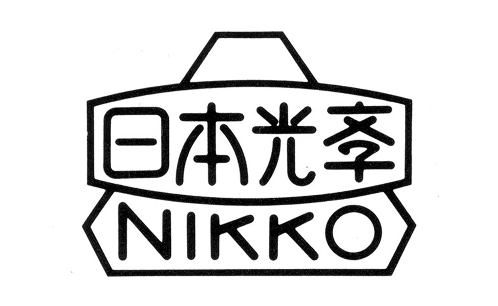
創業期
日本光学工業の創業期から社用箋に使用されたブランドシンボル。
1930年代
レンズをイメージしたブランドシンボル。
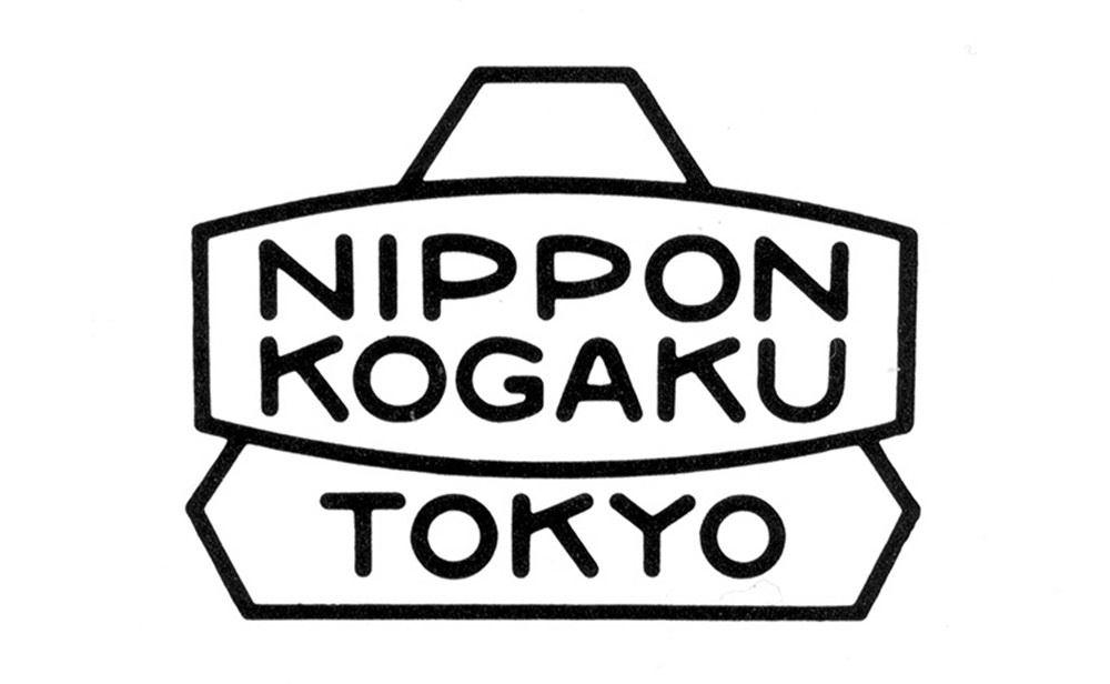
1949
カタログや英文社用箋等に使用。
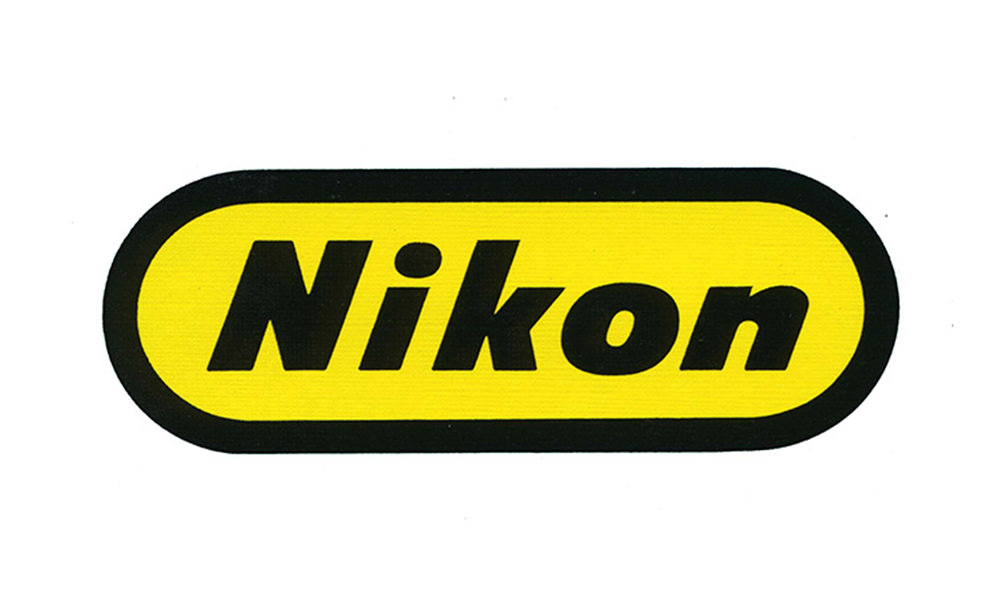
1968
亀倉雄策氏のデザイン。通称「トラックニコン」「トラックマーク」などと呼ばれていた。
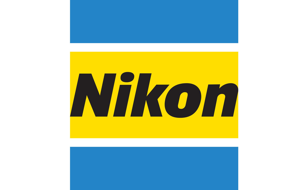
1988
ニコンへの社名変更時に、ブルーを取り入れた新しいブランドシンボルを採用。
2003
現在のブランドシンボルへ。